Cinematography Lighting Breakdown - Love Bash’s “Nights Crawling” Music Video
In today’s blog we’re taking a look at a recent music video shoot for the artist Love Bash latest single, “Nights Crawling.” Be sure to check out the video above.
Table of Contents:
1. Introduction
2. Treatment
3. Scope and Schedule
4. Camera Gear
5. Location Scouting
6. Dealing with inclement weather
7. Pre-visualization of the Apartment Scene
8. Lighting the Apartment Scene
9.Working with multiple cameras
10. Pre-visualization and lighting of the hallway scene
11. Lighting the jail cell
12. Lighting the TV Wall
13. Conclusion
Introduction
In this blog post, we'll dive deep into the lighting and cinematography of the music video for Love Bash's latest single, "Nights Crawling." Inspired by the cinematography and sci-fi aesthetic of Bladerunner, this video brings to life a dystopian, cyberpunk-inspired future where an evil AI has taken over. In this breakdown I'll share my creative process, technical decisions, and how we overcame the numerous challenges we faced during production.
Treatment
Scope and Schedule
For this music video, director Alejandro Montoya Marin and I aimed to create a video that portrayed a dystopian sci-fi future. We had one 12 hour day scheduled to get these 4 vignettes written out in the treatment. While only having one day to shoot this made for tight shooting schedule, we knew that it was still achievable given our discussions in prep on how we would approach the visuals for the shoot.
However our carefully planned shooting schedule was drastically impacted by a very unexpected challenge: a severe weather warning for Hurricane Hilary that was approaching LA and would make landfall on the exact day we had scheduled our shoot. This situation forced us to shorten our shooting schedule from a 12 hour day, to an 8 hour day. This meant we’d have to work as quickly and efficiently as possible to get all the shots needed so everyone could get home safe before the weather potentially turned for the worse. Thankfully, the project was shot entirely on interior sets, allowing us to avoid the added complications and additional safety concerns of working in the rain throughout the day.
Camera Gear
Camera Gear
Shooting multiple cameras with anamorphic lenses.
With the drastic change to our schedule, I had a discussion with Alejandro and our producer Reinhard Lorenz about the need to rent an additional camera and bring on a “B” camera operator. By bringing on a 2nd camera, it allowed us to get twice as many shots in the day and cover multiple angles simultaneously which would be especially necessary now given our now shortened shooting schedule.
To get the dystopian sci-fi, futuristic look we were after for the project, I chose to shoot on the Arri Alexa Mini paired with Xelmus Apollo anamorphic lenses. The unique characteristics of the Xelmus lenses; their barrel distortion, strong lens flares and the distinct oval bokeh fit the look of this project perfectly.
Incredible close focus and versatility:
One of the main reasons I chose the Xelmus Apollo Anamorphic lenses is their remarkable close focusing range, which is beautifully illustrated in this particular shot. This allowed us to seamlessly capture both wide-angle and extremely tight shots without needing to add diopter filters, sped up our workflow on set.
Before shooting, my 1st AC Rose Kwong and I prepped the camera package at Bokeh Rentals in Los Angeles. This was my first time working with the team at Bokeh Rentals and they were incredibly accommodating and supportive, we wouldn’t have been able to get the look we were after without their support on this project.
For an added element on the technical side of the image, the director wanted the ability to speed ramp certain shots to create more of an impact in particular moments, so we decided to shoot the entire video at 48fps so our editor could pick and choose any moment in a shot to slow down as needed.
Having tested these lenses in the past, I found I liked how they performed at a bit of a deeper t stop, so I also shot everything around a t/2.8 or t/4. With the combination of slower shutter speed, and a deeper stop, I had to make sure I had enough power from my lights to get the images we were after.
Lighting and Grip equipment used
1-ton Grip and Lighting Truck from CFG Rentals
Lighting
1 Litemat 4 Spectrum
1 Snapgrid for Litemat 4
1 Litemat 2L Spectrum
1 Snapgrid for Litemat 2L
1 Menace Arm Kit
4 Aputure Infinibars with snap grid
Location Scouting
We shot the video in a warehouse that had been converted into film set in south LA. This location provided multiple pre-built sets that worked perfectly for maximizing our time and not having to work around any location moves. The warehouse came with several sets that we utilized:
Apartment Set: This became our primary location for capturing the intimate, lived-in aspects of our dystopian world.
Shipping Container Set: This helped give us a gritty, industrial feel that complemented our cyberpunk look.
Jail Set: This set was perfect for telling the story of our hero helping people escape from the evil AI.
TV Wall Set: We utilized this as part of the evil scientist's lair, while our production designer created a massive TV throne for our last victim about to be absorbed by the AI.
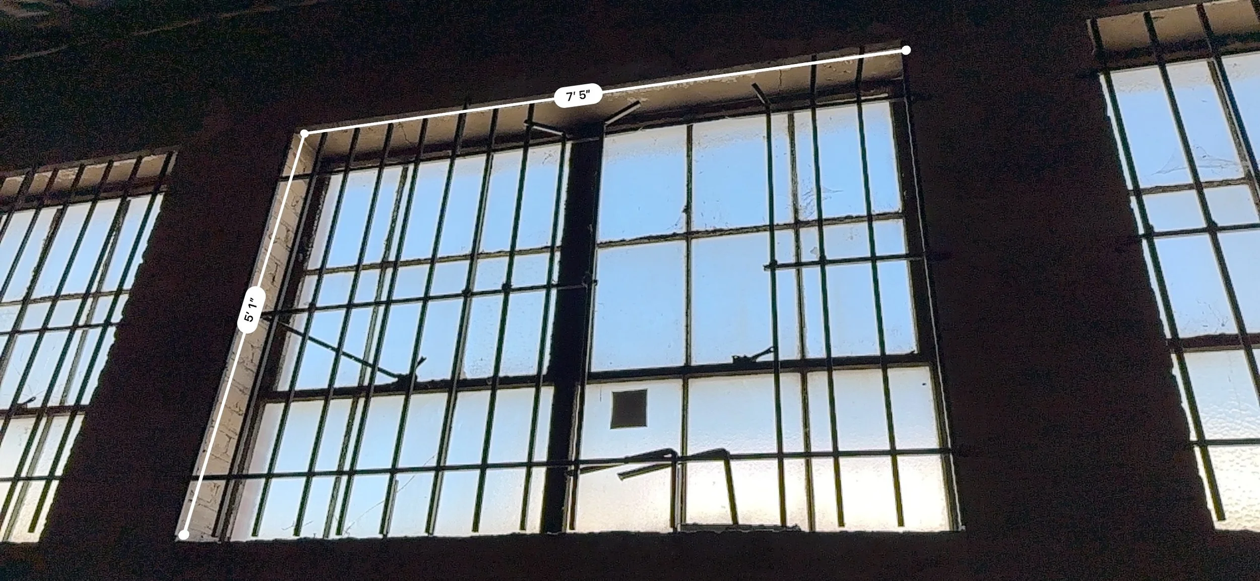
Measuring the windows at location in case we needed to black them out with duvetyn.
During the location scout, one of my main concerns was the massive row of east facing windows along the side of the building. I needed to check whether we would need to block or control the sunlight streaming through these windows, as harsh, direct sunlight could potentially interfere with our lighting setups and continuity.
However, the rainy weather brought on by Hurricane Hilary ended up working in our favor in this regard. The storm gave us cloud cover all day, giving me soft, overcast lighting throughout the day, and eliminating the need to block out any harsh sunlight, or bring in extra lights to create a consistent sunlit look. This was somewhat of a silver lining to the bad weather, and it allowed us to focus our time fine-tuning the lighting rather than battling with inconsistent sunlight.
Best laid plans: the shots that never happened
Early in prep, Alejandro and I talked extensively about the specific shots we wanted to shoot to effectively tell the story. We looked at various options for dynamic camera movement from using a steadicam or gimbal to create fluid camera moves throughout the set, to utilizing a dana dolly for precise, controlled camera movement. We also discussed shooting sequences handheld to heighten tension and create a sense of unease in certain scenes. All of this aimed to enhance the emotional beats of the story. We also discussed ideas for intricate blocking with the actors to reveal certain story elements, particularly in the apartment scene. We initially planned to shoot this sequence in one continuous take.
Shot Designer blocking diagram
This diagram shows the original camera movement concept for the apartment scene. By mapping out the movement in advance, I can quickly communicate the placement of lighting fixtures, actor’s blocking and camera movement to the camera operators, talent, and lighting crew.
Equally important to how we moved - or didn’t move - the camera, was our approach to blocking. We initially discussed an intricate steadicam sequence that was designined to reveal story elements through carefully choreographed action. This idea came to us after we scouted the location - I went home and created detailed lighting and blocking diagrams, using Set A Light and Shot Designer, after physically walking through scenes ourselves. The goal was to help support the story with camera movement that felt motivated, while revealing certain story elements and characters within that unbroken shot.
Here is an idea for a shot that Alejandro illustrated on our location scout while my gaffer Rahul Biruly and looked at available lighting in the apartment set. One of my favorite things about scouting for a shoot is the ideas that come up while you’re physically in the location you’ll be working in. It’s interesting to me how concepts for shots can be inspired by actually being in the space and seeing where everything is in real life, rather than just relying on location photos.
I will always push for an in-person location scout when possible, because doing so allows for a better understanding of the location, its limitations, and its advantages which often leads to new shot ideas that you wouldn’t have had otherwise, or might have had on the day of shooting but weren’t able to plan and budget for in prep.
Ultimately, we had to scrap this idea for the shot due to the changes in our schedule. The changes to our shot list caused by a severe weather warning significantly impacted our shooting schedule, forcing us to rethink our approach to the day. With the tight time constraints we faced, it became clear that we wouldn’t be able to execute this shot as we planned.
Despite the time constraints we would face, by creating blocking and lighting diagrams in prep, it meant that when we arrived on set, every department would be on the same page, working towards a clear and unified vision which would help us get the shots we needed to tell the story.
Shooting in inclement weather
As Hurricane Hilary approached, I worked with the 1st AD and the Director to reorganize our shooting schedule and maximize efficiency to get everyone home as quickly as possible before the weather became more dangerous.
We had members of the AD staff constantly checking the weather radar throughout the day, and the second the weather became too dangerous to continue shooting in, we were ready to pull the plug and wrap the shoot, regardless of if we got all the shots we needed. The crew’s safety was priority number one.
This meant re-evaluating our shot list and rearranging scenes to make the best use of our time. There will always be unexpected delays in production – so being flexible and having the ability to pivot quickly can make all the difference when these challenges come up.
A crucial step we took was moving the grip truck inside the warehouse. This decision was very helpful, as it meant our grip and electric team could continue to work without having to brave the elements to get equipment.
In anticipation of potential power outages, we rented a Honda 7000w generator as a backup which meant that even if we lost power at location, we could continue shooting. While we never lost power, having this as a backup gave us peace of mind and allowed us to shoot without changing our lighting plan.
Pre-visualizing lighting for the Apartment Scene
One of my key tools in prep is Elixxier's Set.A.Light software. I use it to create detailed pre-visualization (pre-vis) lighting overheads using this software. The benefits of this software go beyond just plotting an overhead lighting diagram however, it allows me to get a photo-accurate sense of the lighting for each scene, and I can dial in camera settings like sensor size and anamorphic framing and use a virtual camera to see blocking and test out different focal lengths and aperture. Some of the key uses for Set.A.Light that I like are:
Photo-Accurate Lighting Simulation: Set.A.Light creates a remarkably accurate representation of how different lighting setups will appear on camera. This allows me to experiment with different lighting techniques, lighting intensities, trying out different size and thickness of diffusion frames and negative fill, and adjusting color temperature or gels on lights without ever stepping foot on set.
Blocking and Composition Ideas: While primarily a lighting tool, Set.A.Light also helps me visualize blocking and composition. By placing virtual actors and set pieces in the scene, I can explore different camera angles to see how they interact with my lighting.
Lens Choice Exploration: The software's ability to simulate different focal lengths with both spherical and anamorphic lenses is invaluable. I can switch between various lenses to see how they affect the look of a shot, helping me make decisions about what lenses to use for each scene.
Time and Budget Efficiency: By identifying potential issues or opportunities in the pre-vis stage, I can make adjustments before arriving on set. This saves time during the shoot and can help prevent costly last-minute changes.
Communication Tool: The renders from Set.A.Light are an excellent visual aid when discussing my ideas for lighting and blocking with the director, production designer, camera operators, and grip & electric teams.
Comparing Pre-Vis to Final Results
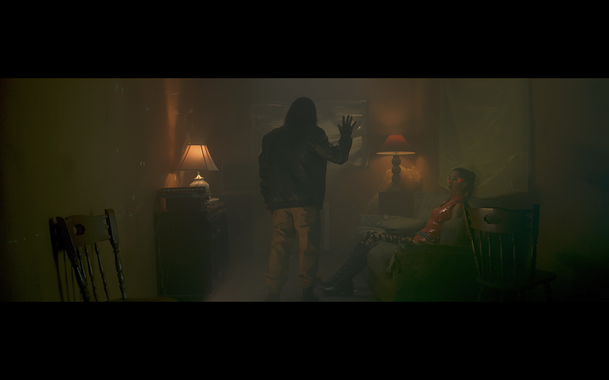
Above you can see a comparison of my renders in Set.A.Light to the final frames of the video. They’re pretty close in terms of lighting and compositions. The one thing I wish that Set.A.Light could do was add volumetric lighting to help render what adding haze might do to a scene.
Lighting Breakdown: The Apartment Scene
Lighting diagram for the apartment set.
Our main set was an apartment that we transformed into a high-rise unit in our sci-fi world. We used a mix of practical lights, heavy haze and carefully placed lights to create depth and atmosphere. This lighting setup was the one of the bigger set pieces in our video, so let's break it down:
Moving lights outside the window: We had our g&e team constantly moving lights to simulate passing vehicles which added a dynamic feel to the static shots.
Practicals: We used B7C bulbs for the visible lamps in the shot. These gave us some nice practical light sources to add depth in the scene.
Key light: A 600C with a spotlight attachment gave us that hard shaft of light coming in from the window.
Fill: We had a 300X with a spotlight for some additional fill and to create shadows on the wall.
Ambient overhead: Two Aputure Infini Bars magneted to the ceiling with honeycomb crates for spill control to give us a nice ambient top light.
Ambient fill: A Litemat 4 Spectrum on the floor provided some soft ambient room light motivated from the green money wall side of the set on the opposite side of the camera. It is especially noticeable on the actor's jacket in close-ups.
Kicker: Not shown in the lighting diagram above, we also had a titan tube on the floor placed vertically and tucked behind some furniture to bring out extra detail on our actress on the couch.
Our moving lighting set up. We briefly experimented with color on both 600C lights. We experimented quite a bit with color on the day. Initially, we played around with mixing reds and pinks for a more neon feel. But in the end, I decided to go for a cleaner look, leaning into a sodium vapor color palette. We used one of the 600Cs for our warm tones, one 600C for our colorful blue lighting, and the 300X for a cleaner, whiter light to balance things out.
For some grungey green fluorescent tones, we brought in a Litemat Spectrum which gave us a nice, soft, wrappy quality that contrasted well with our harder sources.
One of my favorite shots from this setup was a low angle we got with our B-camera. We tucked it into the corner of the room, which gave us this awesome perspective looking up at our talent as he looks out the window.
Working with multiple cameras
Shooting with two cameras on this video was ideal for speeding up our workflow on set, especially given our tight schedule. Being able to use two cameras not only minimized our setup time for each scene but it allowed me to shoot more coverage and get a variety of angles and shot sizes at the same time. I could be setting up the lighting for the main “A” camera angle, while the “B” camera could shoot inserts and detailed shots for the editor to use to give the audience a better sense of the world the characters inhabit.
However, while there are a lot of upsides to using two cameras it’s not without its challenges. Lighting for a two-camera setup can be difficult and making sure that the lighting and composition that’s set for the "A" camera isn’t an issue for the "B" camera shot can be an obstacle. Additionally, making sure that the cameras avoid seeing each other, while still keeping the framing designed for each camera is an added challenge. It all requires well-thought-out blocking, as well as clear communication with the “B” camera operator on set to make sure you’re not in each other’s frame and that all your camera settings match.
While it’s important to design shots that can work for two cameras, it’s equally as important to be flexible on the shoot day with what shots the “B” camera is shooting - not every setup can use two cameras, so knowing when to choose to shoot with a single camera is key. I’ve found that sometimes it’s faster to just shoot a shot with a single camera than it is to try to make it work for two cameras.
Pre-visualization and lighting the hallway scene
The hallway scene was the 2nd scene I pre-visualized using Set.A.Light in prep. It was helpful to be able to test out a very specific lighting idea that the director and I wanted to use - the hard slash of light hitting just our two character’s faces to separate them from the background.
We were able to stick pretty closely to our lighting design from the pre-vis, but on the shoot day, I found that moving the 8x8 diffusion behind our characters helped create to more depth not only on the characters but also on the corrugated sheet metal wall behind them. We also softened the lighting in the background further by using the Litemat 4 with an added diffusion in front and used the RGB abilities to dial in the color to a specific hue that gave us color contrast - the cool background and the warm-toned spotlight on their faces.
Lighting the jail cell
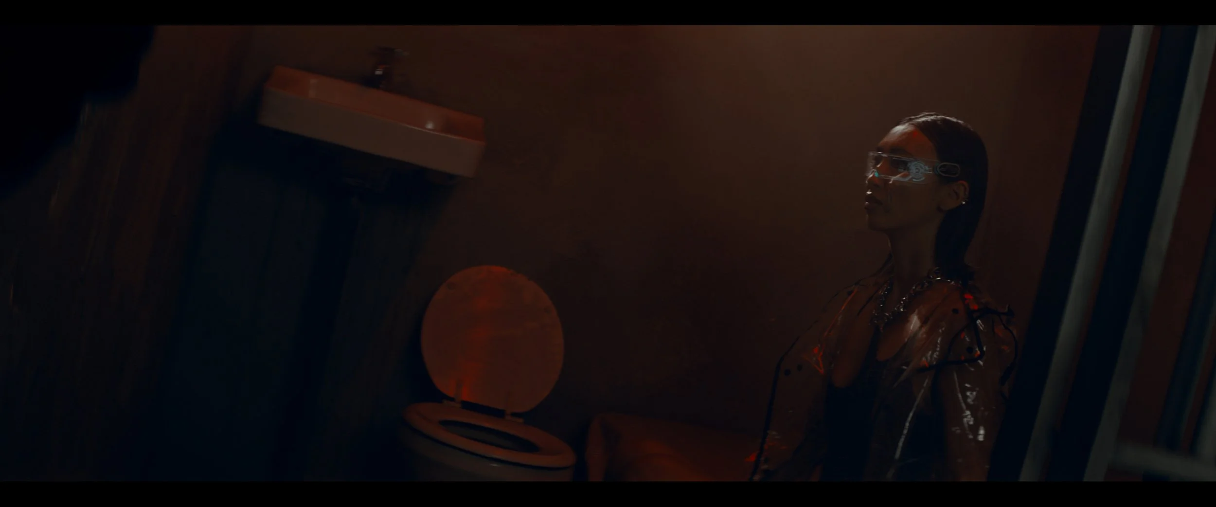
After we shot our hallway scene, we quickly moved over to the prison set. We wanted to add some intensity to the scene through lighting. In this scene, the alarm bells are going off and the guards are alerted to a possible breakout. Our hero and one of the women who have been freed from the AI go to break out another hostage.
We had to be fairly quick with our lighting setup for this scene, as I knew we would need to spend more time in our final scene. So we brought our 300x with a spotlight on a rolling stand and set it up to light through the window of the prison cell, creating a hard slash of light on our subject. I then had 2 titan tube lights on a color chase mode to simulate the alarm going off in the facility, which provided a great color wash through the cell.
For the reverse angle, we used a 2nd 300x with a spotlight, mirroring the hard slash of light from the previous hallway setup - creating more depth and color contrast to the background.
Since this was an existing set at the location, our set decorating team didn’t have to do much to this set before we could shoot it. While we shot this scene, they were focused on setting up for our final location: the TV wall set.
Lighting The TV Wall Set
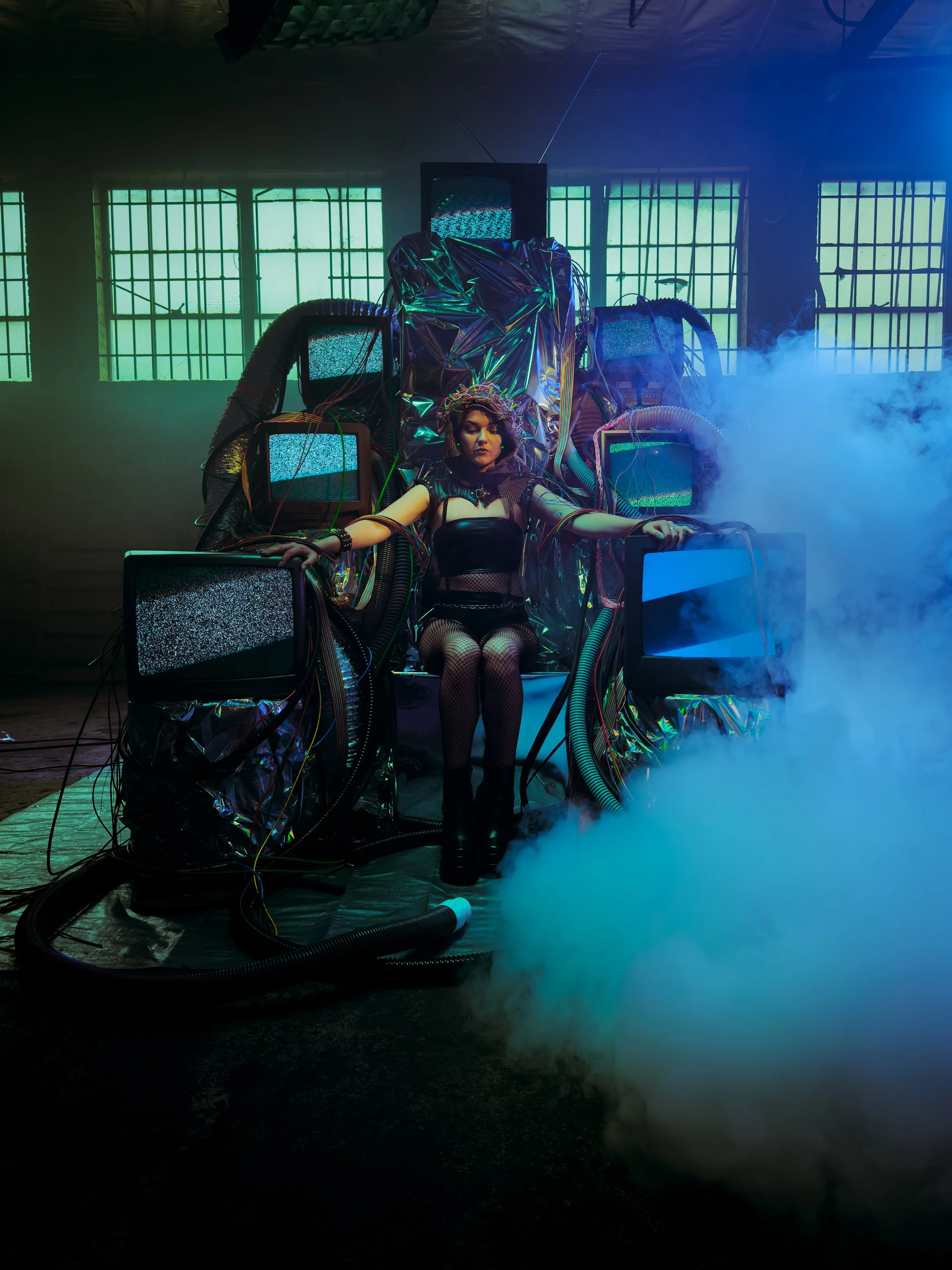
With the prison scene complete were moved on to our final set up for the shoot - the TV wall and TV Throne set. Our production designer Jhene Chase and Set Decorator Anya Wild did a fantastic job creating a throne made up of old TVs that would serve as the soul sucking AI machine.
We had to get a lot of coverage for this scene to tell the story, so I had my B camera operator, David Charry, on a long lens getting inserts of elements on the TV Throne: wires, cables, static on the TV screens. One element of shooting these older TV screens that we had to spend some time figuring out is what shutter angle to set the camera to so we would get the least amount of banding and rolling shutter from the screens. If we kept the camera at a 180º shutter, we would get rolling black bars going across every screen, so we experimented with a few different options and finally settled on an unusual 288ª shutter angle for any shots that we would see the screens in.
We wanted to heighten the visuals even further in this scene, adding layers of distortion in certain shots of the “mad scientist” type character, so we hand held a couple of optical prisms in front of the lens.
As mentioned earlier, with the storm pouring outside, we had parked our grip truck inside the warehouse to keep gear dry. But once everything was built for this scene - the tv throne secured in place and the wall of TV’s for the workstation set up - the grip truck was trapped in place in the background. We wanted to have a pretty abstract background to help build up the industrial cyberpunk warehouse setting anyway and I remember that in prep I had the requested that art department bring some rolls of Visqueen, a semi translucent material, so we hung up a large sheet of that in the background with c-stands which not only hid our truck, but added to the grungy warehouse aesthetic in the story.
I ended up using the sheet of Visqueen as a soft source for our lighting as well - lighting the scene with the 600C set to a warmer color temperature as our overall fill light. We then brought in the Litemat 4 rigged overhead on a rolling stand as our key light that we used to light both the TV Throne set, and the reverse angle of the scientist at the wall of TVs. Our last light for this setup was a 300x with the spotlight positioned at the far edge of the Visqueen wall to give our hero character an edge light and flare the lens for our final shot of the video.
Conclusion
Despite the challenges of shooting during a hurricane and our tight shooting schedule, the combination of using Set.A.Light for pre-vis, getting two cameras for extra coverage, and being flexible with our original blocking allowed us to finish this music video in record time, shooting the whole video in 8 hours. It wouldn’t have been possible if it wasn’t for our amazing cast and crew who worked tirelessly to make it all work.
Despite the challenges of shooting during a hurricane and working with a tight schedule, we completed the entire music video in just 8 hours—a record time for us. Using Set.A.Light for pre-viz, having two cameras for extra coverage, and staying flexible with cutting shots were all critical to making our day in that amount of time. This whole shoot wouldn’t have been possible without our dedicated cast and crew, who not only braved the elements during some of the worst weather of the year, but who worked incredibly hard and efficiently to create this video!
I hope this behind-the-scenes look into the making of this music video gave you some insight into my creative process and the hard work from every department that went into making this video. If you want to keep up with me and my latest projects follow me on Instagram, and please feel free to share your thoughts or suggestions for future blog topics and lighting breakdowns in the comments.


